How We Track the ROI of Your SEO Campaign
A transparent look at how Search Scope measures SEO ROI for Australian businesses: GTM, GA4, GSC, GBP Insights, geo-grid rank tracking, and call tracking all explained.

There’s a version of SEO that goes like this: the agency sends you a PDF every month with a ranking table, tells you you’ve moved from position 8 to position 4 for a keyword nobody ever explained to you, and calls that a result. You pay the invoice. You have no idea whether the campaign is actually making you money.
That’s not how we work.
This article is a transparent walkthrough of every layer in the measurement stack we build for clients from day one, what we track, why we track it, what the data actually shows, and how we tie it back to revenue. If you’re considering working with us on local SEO or Google Maps SEO, read this first. If you’re already a client, this is the system running in the background of your campaign.
Why standard rank reports aren’t enough
Rankings tell you where you sit. They don’t tell you whether anyone searched that term this month, whether the people who found you called, or whether those calls converted to jobs.
A business can rank number one for a keyword with 10 monthly searches and see no commercial benefit. A business can rank number four for a keyword that drives 400 searches a month and generate more leads than it can handle. The ranking alone tells you almost nothing about return.
What actually matters is the chain from search → profile or website visit → contact action → booked job. We instrument every step of that chain.
The full measurement stack
We use eight tools together. No single one gives the complete picture; the value is in how they connect.
- Google Tag Manager: the implementation layer
- Google Analytics 4: the conversion and traffic layer
- Google Search Console: the keyword and organic visibility layer
- Google Business Profile Insights: the local intent layer
- Microsoft Clarity: the behaviour and engagement layer
- Geo-grid rank tracking: the geographic coverage layer
- RingTonic (Twilio): the call attribution and intelligence layer
- seoutils.app LLM rank tracker: the AI citation and visibility layer
Here’s how each one works and what it adds to the picture.
Google Tag Manager: the instrumentation layer
Before any of the downstream reporting is useful, the tracking has to be set up correctly. Google Tag Manager (GTM) is the system we use to deploy and manage all tracking without touching your website’s code every time something changes.
We configure GTM with triggers and tags that fire on the contact actions that matter for your business. Typical events we set up:
- Click-to-call: fires when someone taps or clicks a phone number on your site from a mobile device. This is the most important event for most trades and service businesses, and it’s almost never tracked by default.
- Contact form submissions: fires on confirmed form sends, not just on the “thank you page” (which can be triggered by a back-button navigation and inflate your numbers).
- Calendly bookings: if you take strategy calls or consultations through Calendly, we can capture the booking confirmation event and pass it back to GA4.
- Chat widget interactions: if you use a live chat or chatbot tool.
The goal is to capture every genuine contact action in one place, cleanly, with no double-counting.
Google Analytics 4: non-branded traffic that converts
Once GTM is feeding events into GA4, we mark the most commercially relevant ones as Key Events (previously called Conversions). This lets us filter the reporting to show only what matters.
The question we’re answering in GA4 isn’t “how much traffic did we get?” It’s: which non-branded search traffic is generating contact actions?
Non-branded means someone who didn’t already know your name, they searched for “emergency plumber Subiaco” or “commercial cleaning Melbourne”, found you, and then called or submitted a form. These are net-new leads that came directly from your organic visibility.
The reports we use with clients month-to-month:
- Key Events by channel: how many conversions came from Organic Search vs. Direct vs. Paid.
- Key Events by landing page: which pages on your site are actually driving enquiries. This tells us where to invest content effort next.
- New vs. returning users: for service businesses, most organic leads are first-time visitors. If returning users are disproportionate, something’s off with the targeting.
- Conversion rate by device: call events almost always skew mobile. If desktop conversion rates are very low, it’s usually a website UX issue, not an SEO issue.
We also use GA4’s exploration reports to look at the full path from first touch to conversion for campaigns that have enough volume. For most local businesses, the path is short: search → service page → call.
Google Search Console: what people actually searched
GA4 tells you what happened on your site. Google Search Console (GSC) tells you what people typed into Google before they got there, or before they didn’t get there.
The metrics we pull from GSC each month:
- Impressions: how many times your pages appeared in Google search results.
- Clicks: how many of those impressions turned into visits.
- Average position: where you ranked for those queries.
- Click-through rate (CTR): what percentage of people who saw your result clicked it.
The most valuable view is the queries report filtered to non-branded terms. This shows us exactly which service and location keywords are driving traffic. When we add a new service page or optimise an existing one, GSC is where we confirm it’s working, impressions start rising 4-8 weeks after the change, clicks follow.
GSC also tells us when something has gone wrong. A sudden drop in impressions for a cluster of keywords usually means either a ranking drop (algorithm update, new competitor) or a technical issue (indexing, canonical tags). Catching it in GSC is how we find it before you notice it in your phone volume.
Google Business Profile Insights: local intent signals
For the majority of Search Scope clients, trades, clinics, hospitality, professional services, a significant share of leads come from the Google Maps pack, not the organic blue links. GBP Insights is where we read those signals.
The metrics we track monthly from your Business Profile:
- Direct vs. Discovery searches: Direct means someone searched your business name (they already knew you). Discovery means someone searched a category like “electrician Fremantle” and Google surfaced your profile. We want Discovery to grow.
- Calls from profile: calls made by tapping the call button on your Maps listing. Since late 2024, Google separates calls from the profile versus calls from your website link.
- Direction requests: a strong intent signal for premises-based businesses.
- Website clicks from profile: how many people tapped through to your website from Maps.
We cross-reference GBP Insights data with GA4. If GBP shows 40 profile calls in a month but your website only shows 15 call events, the other 25 calls happened without a website visit at all, they called straight from Maps. That’s a segment of your leads that GA4 can’t capture on its own, which is exactly why we also deploy call tracking (more on that below).
For deeper context on reading these numbers, our guide on Google Business Profile Insights covers the diagnostic framework we use.
Microsoft Clarity: how people actually behave on your pages
GA4 tells you that 200 people visited your service page this month. Clarity tells you what they actually did when they got there, where they scrolled to, what they clicked, where they got frustrated, and where they gave up.
We install Microsoft Clarity on every client site. It’s free, it runs alongside GA4 without conflict, and the data it surfaces changes how we interpret conversion numbers.
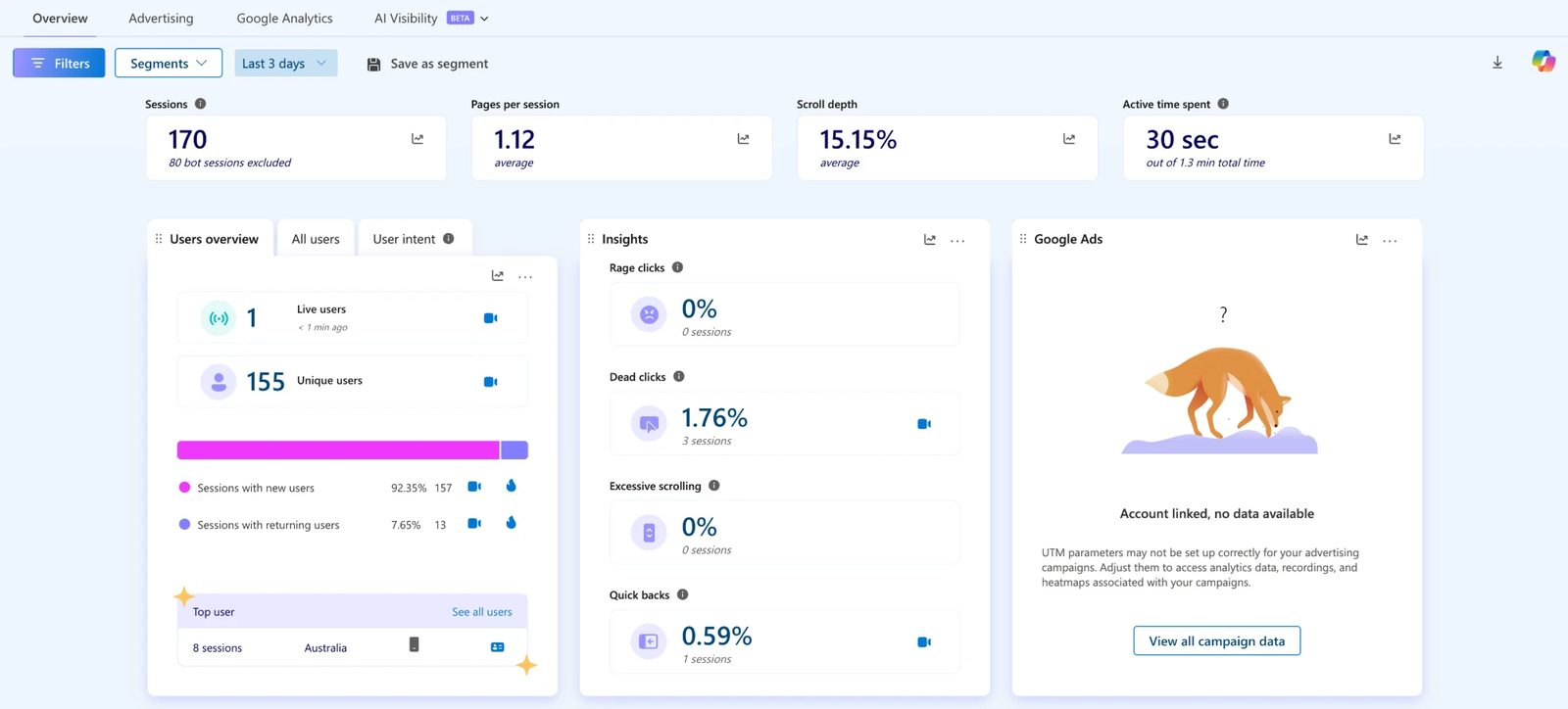
What Clarity adds to the picture:
- Session recordings: anonymised video replays of individual user sessions. When a page has good organic traffic but low conversions, we watch recordings to see exactly where people are dropping off. Nine times out of ten it’s a layout issue, a broken element on mobile, or a CTA that’s too far down the page.
- Heatmaps: click maps, scroll maps, and area maps showing where users engage and where they ignore. If the most-clicked element on a service page is a photo rather than the phone number, that tells us something about where attention is going.
- Scroll depth: the average scroll depth metric in the Clarity overview shows us how far down pages users typically read. If scroll depth on a long-form service page is 15%, most people aren’t reaching the social proof or the CTA.
- Smart events: Clarity’s AI-powered behavioural flags: rage clicks (users clicking repeatedly in frustration), dead clicks (clicking on things that aren’t interactive), quick backs (landing and immediately leaving), and excessive scrolling. We cross-reference these with our GTM/GA4 event data, if a page has high organic sessions, good time-on-page in GA4, but also a high rage click rate in Clarity, there’s a UX problem masking itself as engagement.
- User intent segmentation: Clarity groups sessions into intent categories based on behaviour patterns, letting us separate casual browsers from high-intent visitors and understand which pages are attracting the wrong audience.
The combination of Clarity behaviour data and GA4 conversion events is especially powerful for diagnosing pages that rank well but don’t convert. Ranking isn’t the end goal, the page still has to do its job once someone lands on it.
![]()
Geo-grid rank tracking: where you rank across your whole service area
A single ranking position tells you where you sit at one point in space. For a service area business, or any business trying to dominate a suburb or city, that single number hides a lot.
We use a geo-grid rank tracker that plots your Google Maps ranking at dozens of points across your actual service area. The result is a heatmap: dark green where you’re ranking in the top three, lighter colours where you’re falling off, red where a competitor is dominating.
This matters because local rankings vary dramatically by distance from your business address. You might rank number one for “landscaper” within 2km of your depot and drop to number nine 8km out. Without the grid, you’d never know which suburbs to push harder in.
The overlay layers that turn rankings into strategy:
Beyond the ranking heatmap, the geo-grid tool we use allows us to overlay demographic data from the ABS Census 2021, Australia-wide, at tract level. This includes:
- Population density: where the most people are
- Median household income: where your highest-value customers live
- Homeowner percentage: critical for home services (owners renovate; renters don’t)
- Median age: helps tailor service emphasis in different zones
When we overlay, say, median household income on top of your ranking data, we can see exactly which high-income postcodes you’re not yet visible in, and prioritise those in the campaign. For a bathroom renovation company, ranking top three in a high-income suburb is worth more than ranking top three in a suburb where the median household income is half the price.
We can also compare snapshots over time to show rank movement across the full grid, not just “you went from position 5 to position 3 for one keyword,” but “your green zone expanded by 14 grid points to the north and northeast over the last 90 days.”
RingTonic call tracking: knowing which calls came from SEO
The gap in most SEO reporting is calls. A prospect searches, finds your profile or website, and calls you. That call happens on a phone. Unless you’re tracking it, you’re invisible to the attribution model.
We include RingTonic call tracking in most SEO plans. Here’s how it works.
RingTonic assigns tracking numbers to your campaigns using Twilio, the same infrastructure major enterprises use for communications. Calls to those numbers are recorded (with appropriate disclosure), transcribed, and attributed to their source.
What RingTonic tells us that nothing else can:
- Where the call came from: organic search, Google Maps, a specific ad campaign, direct traffic. Every call has a source.
- Dynamic Number Insertion (DNI): your website automatically swaps the displayed phone number based on how the visitor arrived. Someone coming from organic search sees a different number to someone coming from a Google Ad. When they call, we know exactly which channel drove it.
- Call transcription and speaker diarisation: every call is transcribed with automatic speaker identification. We can review what was said without listening to every recording.
- Lead scoring: AI analysis classifies each call as a qualified lead or not, and estimates the deal value based on what was discussed. This is what closes the gap between “calls received” and “revenue generated.”
- Keyword spotting: flags calls where specific services, competitor names, or budget signals were mentioned.
The Twilio usage cost (the actual phone line charges) sits outside our plan fee and is passed through at wholesale rates, roughly $1.15 per number per month and fractions of a cent per call minute. For a typical local business with 2-3 tracking numbers and a few hundred minutes per month, this is a negligible cost.
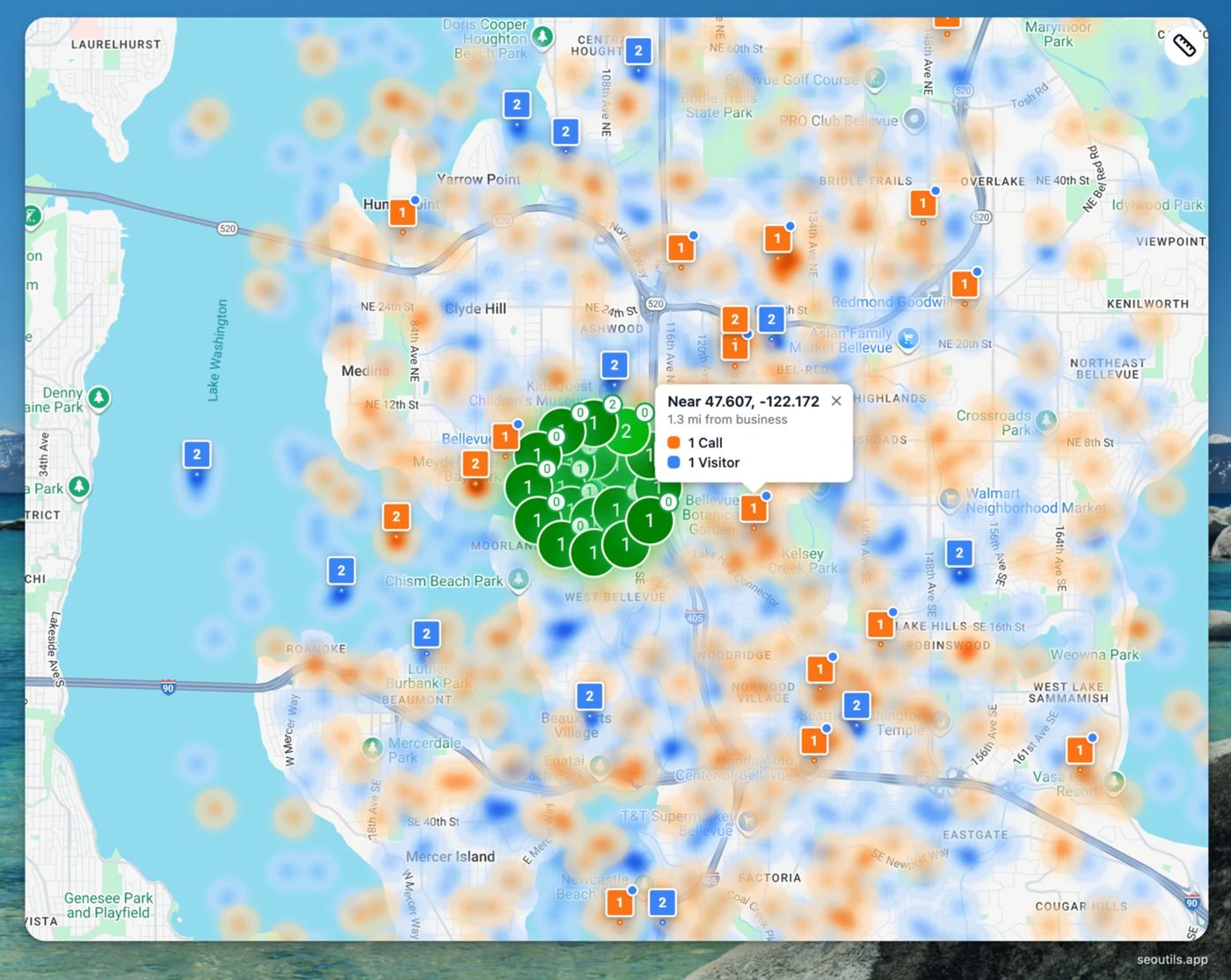
The Money Map: When RingTonic is connected to the geo-grid tracker, it adds a layer we call the Money Map. This overlays your call origins (orange heat zones) on top of your ranking grid, so you can see not just where you’re ranking, but where your calls are actually coming from geographically. If you’re ranking well in a suburb but getting no calls from it, that’s a signal the traffic isn’t converting. If you’re getting calls from a suburb where you’re not ranking strongly, that’s a signal to push harder there.
seoutils.app LLM rank tracker: your AI citation visibility
Traditional SEO tracks where you rank in Google’s blue links. But a growing share of research and buying decisions now start in ChatGPT, Google AI Overviews, Perplexity, and Gemini, and those platforms don’t have a “page 2.” Either your business is cited in the response, or someone else’s is.
We track this using the LLM rank tracker inside seoutils.app, built specifically for measuring brand visibility across AI-generated search responses. It runs your business against a set of tracked queries across multiple AI platforms and surfaces exactly how often you’re being cited, where you appear, and how you’re characterised.
What the LLM tracker measures:
- Visibility Score: the percentage of tracked queries where your brand appears in the AI response. A score of 40% means you’re cited in four out of every ten relevant AI answers generated on your topic.
- Top 3 Visibility: how often your brand appears in the first three citations, not just somewhere in the output. Top-of-response placement is where referral traffic actually originates.
- Average Position: your typical rank within AI responses across the tracked query set.
- Detection Rate: how consistently AI platforms can find and surface your business. Low detection usually points to schema gaps, thin content, or authority issues on the pages covering that topic.
- Sentiment Score: a 0-to-100 index measuring whether AI responses mention your brand positively, neutrally, or negatively. AI platforms don’t just cite you, they characterise you, and a neutral or negative characterisation affects whether the referral converts.
- Citations: the specific sources AI platforms pull from when they mention your business. This tells us which of your pages (or third-party mentions of you) are doing the heavy lifting for AI retrieval.
- Share of Voice: your citation rate relative to competitors across the same query set. The AI-equivalent of rank position: who owns the conversation in your category.
The tracker runs across four reporting views: Overview (Visibility Score, Average Position, and Detection Rate over time), Competitors (your AI visibility vs. specific benchmarked competitors), Citations (which sources are driving your mentions and which competitor sources are outranking you), and Sentiment (tone analysis across your AI appearances, with flagged mentions for review).
Geo-targeting is supported, we can track your AI visibility by city or region, which matters for local SEO campaigns where market-specific AI responses vary significantly from national results.
This layer closes the gap between traditional measurement and the new reality of AI search. When your AI Visibility Score rises in parallel with Maps pack rankings and non-branded organic traffic, the compound signal is the clearest indicator a campaign is building authority across every channel a prospect might use to find you.
What the monthly reporting actually looks like
Every month, we pull these data sources together into a single reporting document. The structure is consistent so you can track trends across months, not just compare one snapshot to the next.
The numbers we lead with:
- Key Events (conversions) from organic search: calls, form fills, bookings
- Non-branded organic sessions: new people finding you for service keywords
- GSC impressions and clicks (non-branded queries)
- GBP Discovery searches and profile calls
- Clarity behaviour summary: scroll depth, rage clicks, session recordings flagged for review
- Geo-grid rank changes: net new grid points in the top 3, movement in priority suburbs
- RingTonic lead summary: total calls, qualified leads, estimated deal value by source
- LLM Visibility Score: AI citation rate, Average Position, Sentiment Score, and top citations by platform
What we then diagnose:
- Where conversions increased and why
- Where traffic dropped and what caused it
- Which new keywords are generating impressions but not yet clicks (optimisation opportunities)
- Which suburbs the grid shows as the next expansion target
- Which calls were qualified and which weren’t (so we can assess whether the SEO is attracting the right type of customer, not just volume)
The last point matters more than most clients initially expect. A campaign that drives 60 calls with 40 qualified leads is worth more than one that drives 100 calls with 15 qualified leads. RingTonic’s AI scoring is how we measure that distinction over time.
A note on what we can’t track (and what we do about it)
No attribution stack is perfect. There are leads we can’t capture directly:
- Someone who sees your Maps listing, saves it, and calls a week later from a number they stored in their phone.
- A referral who found you through a client, searched your name to confirm you’re legit, and called.
- Walk-ins from a neighbourhood they drove through where your signage was visible.
These are real leads. They’re just not attributable to a specific campaign touchpoint. We call them “dark conversions” and we account for them by tracking your total inbound enquiry volume (with your help) against the traceable numbers. When traceable conversions go up and total enquiries go up together, the correlation is strong. When they diverge, there’s something to investigate.
The honest position: SEO attribution is better than most marketing channels and worse than a direct transaction. What we can prove is more than enough to justify the investment, and the reporting framework above is designed to make that case clearly every single month.
FAQ
Do I need to set up any of these tools myself? No. We handle the GTM setup, GA4 configuration, key event tagging, and RingTonic campaign setup as part of onboarding. You give us access to the relevant accounts (or we create them for you) and we build the measurement layer before the campaign starts.
What does RingTonic call tracking cost? The RingTonic platform fee is included in most plans. Twilio usage, the actual call charges, is billed at wholesale rates directly and is typically a small figure for local service businesses. We’ll give you an estimate based on your expected call volume before we set it up.
Can I see the call recordings and transcripts? Yes. You have full access to your RingTonic dashboard, including recordings, transcripts, and lead scores. We also flag any calls worth reviewing in your monthly report.
How long until I have useful data? The tracking setup works from day one. Meaningful trend data, enough to make decisions, typically takes 60-90 days. GSC keyword data can take 2-4 weeks to populate for new pages.
What if I’m getting leads from Google Maps but my website traffic looks flat? That’s common, especially for trades. GBP Insights captures Maps-origin calls that never touch your website. The combination of GBP data and RingTonic is how we see the full picture when GA4 alone would undercount.
Can you track leads that came from a specific suburb or postcode? Yes, via two routes. The geo-grid heatmap shows where you’re ranking by location. The RingTonic Money Map layer shows where your inbound calls are originating geographically. Together they let us see both supply (your visibility) and demand (where the calls are coming from) at a suburb level.
What’s the difference between a key event and a regular event in GA4? A regular event fires and is recorded in GA4 but doesn’t roll up into the main conversion reports. A key event is flagged as commercially significant and appears in the primary reporting views. We mark the actions that represent real business intent, calls, form fills, bookings, as key events so the reporting stays focused on what matters.
If you’re at the pre-campaign stage and want to model what SEO might return before committing, the SEO ROI calculator runs 12-month revenue projections from your current search volume and conversion data.
If you’d like to see what this reporting looks like in practice for a business in your industry, book a 30-minute strategy call. Bring your current analytics setup (or lack of one) and we’ll walk through exactly what we’d instrument and what you’d be able to see within 90 days.