10 Mobile UX Tips for Australian Local SEO
Last Updated on 25 September 2025 by Dorian Menard
Want to boost your local SEO and attract more customers? Start by optimising your mobile user experience (UX).
Here’s why it matters:
- 61% of users won’t return to a site that’s hard to use on mobile.
- 76% of local mobile searches lead to a store visit within 24 hours.
- Mobile "near me" searches have increased by 28% in the past year.
Key Takeaways:
- Mobile-Friendly Design: Ensure responsive layouts, touch-friendly elements, and easy access to key details like hours and directions.
- Speed Optimisation: Compress images, enable caching, and minimise code to improve load times.
- Touch Navigation: Use large buttons, simple menus, and thumb-friendly layouts.
- Local Keywords: Incorporate location-specific terms like "coffee shop near me" into titles, meta tags, and content.
- Google My Business: Keep your profile updated with accurate hours, photos, and contact info.
Quick Comparison Table:
| Tip | Why It Matters | Example Impact |
|---|---|---|
| Mobile-Friendly Design | Improves usability and rankings | 20% increase in mobile traffic |
| Speed Optimisation | Reduces bounce rates | 50% faster load times = 15% more conversions |
| Local Keywords | Matches user intent | Higher visibility in "near me" searches |
| Google My Business | Drives in-person visits | 2.7x more likely to gain trust |
Bottom Line: A seamless mobile experience not only improves rankings but also attracts more local customers. Let’s dive into the 10 tips to make it happen.
Does Mobile Optimisation Help SEO?
1. Mobile-Friendly Design
A mobile-friendly design is crucial for strong local SEO. It ensures your site is easy to use on mobile devices through responsive layouts, touch-friendly features, and clear content.
Mobile users often look for quick access to key information like:
- Business hours
- Contact details
- Directions
- Service menus or product catalogs
For example, a Perth-based café chain recently worked with our agency Search Scope to revamp their mobile site. The result? More mobile traffic and fewer visitors leaving immediately.
This shows how improving mobile usability can directly boost both user experience and local SEO.
To make your site mobile-friendly, focus on:
- Responsive layouts that adapt to any screen size
- Properly sized touch elements
- Fonts that are easy to read
- Generous spacing for better navigation
Google’s Mobile-Friendly Test is a handy tool to spot and fix issues that might be holding your site back. A user-friendly mobile experience signals to search engines that your site prioritises visitors, which can lead to better rankings in local searches.
After optimising for mobile usability, the next step is ensuring your site loads quickly to keep visitors interested.
2. Speed Optimisation
Page speed plays a huge role for mobile users and local SEO. Even a single second of delay can reduce conversions by 7%.
Improving load times with methods like image compression, browser caching, and code minification can increase user satisfaction and improve your search rankings. Faster sites not only make users happy but also have a better shot at ranking higher in local search results, where speed is a key factor.
You should aim for:
- Largest Contentful Paint (LCP): ≤ 2.5s
- Interaction to Next Paint (INP): ≤ 200ms
- Cumulative Layout Shift (CLS): ≤ 0.1
Here are some key techniques for improving speed that directly impact local search performance:
| Optimisation Technique | Benefit for Mobile Users |
|---|---|
| Image Compression | Cuts load times by up to 90% |
| Browser Caching | Reduces HTTP requests |
| Code Minification | Speeds up processing |
| CDN Implementation | Lowers latency |
For example, a business featured in Search Engine Journal cut its page load time by 50% using image compression and browser caching. The result? A 20% increase in traffic and 15% more conversions.
To fine-tune your mobile site’s speed:
- Compress Images: Switch to formats like WebP to reduce file sizes.
- Enable Browser Caching: Let returning visitors experience faster load times by minimising server requests.
- Minimise Code: Simplify HTML, CSS, and JavaScript to improve processing speed.
- Use a CDN: Spread content delivery across multiple locations to reduce delays.
Monitor with: Google PageSpeed Insights, CrUX, and GSC’s CWV reports. Re-test fortnightly as your site evolves.
Use tools like Google PageSpeed Insights to stay on top of your site’s performance. This tool offers specific recommendations based on your current setup, helping you pinpoint areas for improvement.
Keep in mind, optimising speed isn’t a one-and-done task. As your site evolves, you’ll need to revisit and tweak your strategies to maintain top performance for mobile users.
Once your site is running smoothly and quickly, it’s time to focus on making it easy to navigate.
3. Easy Touch Navigation
Making navigation touch-friendly is a must for mobile users and plays a big role in local SEO.
Research shows that 61% of users won’t revisit a mobile site if they find it hard to navigate. Good touch navigation not only keeps users on your site but also helps search engines recognise it as mobile-friendly – crucial for local SEO.
When designing for mobile, think about thumb zones – the areas of a screen that are easiest to reach with a thumb. Here’s how common navigation elements stack up in terms of accessibility:
| Navigation Element | User Accessibility |
|---|---|
| Hamburger Menu | High – top corners |
| Sticky Header | Excellent – always visible |
| Bottom Navigation Bar | Maximum thumb reach |
| Fixed CTAs | Moderate – mid-screen |
Tips for Better Touch Navigation:
- Make Buttons Big Enough: Interactive elements should be at least 44×44 pixels to ensure they’re easy to tap.
- Place Key Info Strategically: Features like contact details or location info should sit in thumb-friendly areas, typically on the bottom half of the screen.
- Keep Menus Simple: Organise content into clear categories, and make sure users can easily find what they need without excessive scrolling or tapping.
- Use Visual Feedback: Add visual cues, like a color change, to confirm when a button is tapped.
To test how touch-friendly your site is, try tools like Google’s Mobile-Friendly Test or run tests on real devices. Keep an eye on metrics like bounce rate and time spent on site using Google Analytics to see if your changes are working.
Once your navigation is optimised, the next focus should be on creating user-friendly forms to simplify interactions.
4. Simple Mobile Forms
Mobile forms play a crucial role for local businesses, shaping both user experience and SEO performance. A well-thought-out mobile form not only makes it easier for users to engage but also shows search engines that your site is designed for local interactions.
What Makes a Mobile Form Work for Local SEO?
| Form Element | Best Practice | Impact on Local SEO |
|---|---|---|
| Input Fields | Limit to 3-5 key fields | Reduces bounce rates |
| Field Types | Use HTML5 input types | Speeds up form completion |
| Button Size | At least 44×44 pixels | Improves touch accessibility |
| Local Context | Include city/ZIP code fields | Adds geographical relevance |
Smart Design Tips for Better Forms
Good mobile forms are all about simplicity and efficiency. Using HTML5 input types ensures the right keyboard pops up on mobile devices, making it quicker for users to fill out forms.
Adding fields like city names or ZIP codes can also improve your local search rankings by signaling relevance to search engines.
Here’s a real-world example: Domino’s Pizza saw a 28% jump in mobile orders by making their forms easier to use. They achieved this by:
- Adding location-based smart defaults
- Keeping forms on a single screen wherever possible
- Providing clear visual feedback
- Using touch-friendly dropdown menus
Accessibility Matters
To make your forms usable for everyone, including people with disabilities, follow WCAG 2.1 guidelines. This includes clearly labeling fields and ensuring strong color contrast for better readability.
Once your forms are optimised, the next move is to focus on local keywords to further boost your site’s visibility.
5. Local Keywords
Location-based keywords are a key part of improving mobile user experience and boosting local SEO. When people search on their phones, they’re often looking for nearby solutions they can access immediately.
Using Local Keywords Effectively
To get the most out of local keywords, you need to weave location terms naturally into your content. This not only helps users but also makes your site more relevant to search engines.
| Keyword Type | Example Usage | Mobile UX Benefit |
|---|---|---|
| City-Based | "Perth coffee shop" | Matches local intent directly |
| Neighborhood | "Fremantle seafood restaurant" | Targets specific areas |
| "Near Me" Variations | "dentist near me open now" | Captures immediate needs |
| Local Landmarks | "cafe near Kings Park" | Adds local context |
See our hyperlocal SEO guide for suburb-specific tactics.
Optimising for Mobile Search
Since 84% of "near me" searches come from mobile devices, it’s important to focus on short, location-specific phrases that match how people search on their phones. Here’s where to integrate these terms:
- Page Titles: Keep them short and include the location.
- Meta Descriptions: Naturally work in key location terms.
- Header Tags: Use location keywords when they fit the context.
- Content Body: Add local details in a way that feels natural.
Creating Location-Specific Pages
- Design pages that focus on a single location or service area.
- Highlight nearby landmarks and neighborhoods.
- Use schema markup tailored to the location for better search visibility.
sbb-itb-c74901f
6. Optimise Google My Business
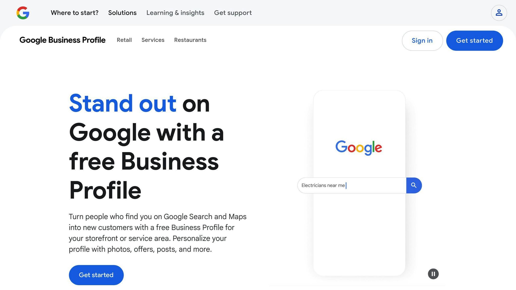
For mobile users, your Google Business Profile is often the first interaction they have with your business. A well-maintained profile ensures they can quickly find the information they need, making it a key part of your mobile user experience.
Key GMB Elements to Focus On
| Element | Mobile UX Impact | Optimisation Tips |
|---|---|---|
| Business Hours | Avoids unnecessary visits | Keep hours updated, including holidays |
| Photos | Gives users a visual preview | Use high-quality, fast-loading images |
| Contact Info | Simplifies communication | Add click-to-call buttons and clickable maps |
| Reviews | Builds credibility | Respond to reviews within 24-48 hours |
Features Designed for Mobile
Businesses with fully optimised GMB profiles are 2.7 times more likely to be seen as trustworthy by mobile users. Focus on features that make the mobile experience seamless:
- Short, easy-to-read business descriptions
- Fast-loading, high-resolution images
- One-tap options for calling or navigation
- Clear service listings designed for small screens
"Claiming and optimising your Google My Business listing is one of the most important steps in local SEO." – Jimmy Huh, SEO Expert, JH SEO Agency
Managing Reviews Effectively
Reviews play a huge role in influencing decisions, especially for local searches. Here’s how to handle them:
- Reply quickly and professionally
- Naturally include relevant keywords in responses
- Address complaints constructively
- Regularly check and manage the Q&A section
Use Structured Data
Adding structured data markup to your GMB profile can improve its visibility on mobile devices. This helps search engines understand your business better and display relevant information to users.
Keep Your Profile Fresh
Regular updates keep your GMB profile relevant and engaging. Here’s what to do:
- Post weekly updates about your products or services
- Upload new photos frequently
- Ensure business hours are always accurate
- Answer customer questions promptly
With 70% of users visiting a physical store within 24 hours of a local search, optimising your GMB profile for mobile users can directly drive foot traffic. Once your profile is in top shape, you can dive into how voice search can further boost your mobile strategy and local SEO efforts.
7. Voice Search
Optimising for voice search is essential for improving mobile user experience and boosting local SEO. With 55% of teenagers and 40% of adults using voice search daily, businesses must fine-tune their mobile platforms to meet this rising demand.
Natural Language and Long-tail Keywords
Voice searches are more conversational and often longer than typed queries. To align with how people speak, focus on:
- Questions like who, what, where, and how to mirror common voice search patterns.
- Writing in full sentences instead of relying on fragmented keywords.
- Targeting phrases such as "What’s the best Italian restaurant open now in Perth?" instead of "Italian restaurant Perth."
Featured Snippet Optimisation
Voice assistants frequently pull answers from featured snippets, making them a key focus for visibility. Here’s how to tailor your content:
| Content Type | How to Optimise | Example Format |
|---|---|---|
| FAQ Sections | Use direct Q&A formatting | "Where can I find the best coffee in Fremantle?" |
| Local Content | Provide location-specific info | "Our store in Perth offers same-day mobile phone repairs." |
| Business Info | Add structured data markup | "Open Monday-Friday, 9 AM-5 PM" |
| Quick Facts | Keep answers short and clear | "Free parking available on-site" |
Technical Implementation
Getting the technical details right is just as important for voice search:
- Use Structured Data: Apply schema markup for business hours, service areas, and customer reviews.
- Optimise Mobile Speed: Ensure pages load in under 3 seconds to improve rankings and user experience.
Regular Testing
Consistently evaluate:
- The accuracy of answers provided by voice assistants.
- How quickly responses are delivered.
- Whether the content remains relevant to local users.
Once your voice search strategy is in place, consider how mobile apps can further strengthen your local SEO efforts.
8. Mobile App
A mobile app can enhance your local SEO efforts by offering a personalised experience that goes beyond what a mobile site can provide. Recent studies show that mobile apps are a powerful way for businesses to connect with local customers and increase engagement.
Key Features for Local SEO
To make the most of your mobile app for local SEO, include these important features:
| Feature | SEO Benefit | Example Use Case |
|---|---|---|
| Location Services | Better local targeting | Real-time store locator with alerts based on proximity |
| Push Notifications | Increased user engagement | Location-based deals and updates |
| User Reviews | Higher visibility in search | Simple in-app options for leaving feedback |
Optimising App Performance
Pay attention to these performance aspects to ensure a smooth user experience:
- Launch Speed: Aim for app initialisation in under 2 seconds.
- Smart Design: Use intuitive navigation and local data caching to speed up the app.
- Data Efficiency: Reduce network usage by using compressed images and streamlined content.
Aligning Your App with Local SEO Goals
Your mobile app should strengthen your local strategy by focusing on these areas:
- App SEO: Use deep linking to connect app content with search results and optimise app store listings with location-specific keywords.
- Consistency Across Platforms: Ensure your business hours, contact info, and location details match across your app, website, and Google My Business profile.
- Encouraging Reviews: Make it simple for app users to leave reviews directly within the app.
Tracking Performance
Monitor these metrics to understand how your app supports local SEO:
- Number of downloads and user activity in your target areas
- How long and how often users engage with the app
- In-app conversion rates
- Changes in your local search rankings
- Feedback and ratings from app users
A mobile app not only boosts local engagement but also complements your overall user experience when aligned with your broader Perth SEO strategies.
9. UX Focus
User experience (UX) plays a crucial role in local search performance and user engagement. By focusing on UX, businesses can create smooth mobile experiences that keep users engaged and send positive signals to search engines.
Key UX Elements and Performance Metrics
A strong mobile UX can increase conversion rates by 14.9%. Below is a breakdown of how specific elements influence local SEO:
| Element | Impact & Metrics | Implementation Tips |
|---|---|---|
| Visual Hierarchy | Reduces bounce rates, increases time on site | Use clear content structures and prominent CTAs |
| Local Integration | Boosts engagement and rankings | Add interactive maps and geotargeted features |
| Accessibility | Improves user retention, lowers exit rates | Use high-contrast text and readable typography |
| Mobile Navigation | Drives conversions, extends session lengths | Design intuitive menus and include location-based shortcuts |
Mobile-First Design Principles
Responsive design can lower bounce rates by 11% compared to non-responsive layouts. Focus on these aspects for a better mobile experience:
- Intuitive Layout: Arrange content with a clear visual structure.
- Local Context: Highlight location-specific information prominently.
- Quick Actions: Make directions, calls, and bookings easily accessible.
- Visual Content: Ensure images and media are optimised for mobile devices.
Content Optimisation
A HubSpot study shows that 70% of users prefer learning about businesses through articles rather than ads. To make local content easy to consume on mobile devices:
- Use clear headings and subheadings.
- Write short, scannable paragraphs.
- Ensure text has high contrast for readability.
- Place location-specific details prominently, ideally above the fold.
Regular testing is essential to ensure your UX continues to meet user expectations and supports your local SEO efforts effectively.
10. Regular Testing
Testing your mobile site regularly helps maintain its performance for both user engagement and local SEO. It ensures your site stays user-friendly and shows search engines that it’s dependable and optimized for local audiences.
Key Testing Components
| Testing Area | Frequency | Impact on Local SEO |
|---|---|---|
| Responsive Design | Monthly | Keeps your site looking good on all devices |
| Page Speed | Every 2 Weeks | Helps lower bounce rates, boosts rankings |
| Touch Elements | Every 3 Months | Improves usability and engagement |
| Local Features | Monthly | Confirms location-based features work well |
Performance Monitoring
Mobile testing should focus on three main areas that directly influence local SEO:
- Loading Speed: Make sure your site loads quickly across all devices. Use tools like PageSpeed Insights to track loading times and ensure everything works smoothly on different screen sizes.
- Touch Functionality: Test interactive features like click-to-call buttons, contact forms, and maps. These should be easy to use and fully operational.
- Display and Accessibility: Check that your site looks good and functions properly on mobile devices of all shapes and sizes.
Data-Driven Optimisation
Use analytics to guide your testing and improvements. Keep an eye on metrics like:
- Mobile bounce rates
- Page load times
- User engagement
- Local conversion rates
- Mobile search rankings
This data will help you fine-tune your site and make informed updates that improve both user experience and local SEO performance.
Conclusion
Achieving success in local SEO hinges on effective mobile user experience (UX) strategies. A well-thought-out mobile approach not only improves user satisfaction but also directly impacts search rankings and business results.
Here are some key metrics to focus on:
| Mobile UX Element | Impact on Performance |
|---|---|
| Speed Optimisation | Boosts conversions and reduces bounce rates |
| Touch-friendly Navigation | Encourages user interaction and longer site visits |
| Local Keyword Integration | Improves local rankings and visibility |
| Regular Testing | Maintains consistent performance and search presence |
Mobile optimisation isn’t just about fixing technical issues – it’s about creating a connection with your local audience. By prioritising responsive design, fast loading times, and intuitive navigation, businesses can improve their local search rankings while delivering real value to users.
Ongoing updates and testing are crucial to staying competitive. Regularly reviewing your mobile performance ensures your site keeps up with changing user needs and search engine criteria.
"The combination of mobile-friendly design and optimised local content creates a powerful foundation for local SEO success. When businesses focus on user experience, they naturally align with search engine requirements for better visibility", explains Search Scope, highlighting how UX and SEO work hand in hand.
As mobile technology continues to advance, businesses that prioritise user-friendly experiences and maintain strong technical standards will lead the way in local SEO. Partnering with experts like Search Scope can help implement these strategies effectively, driving lasting growth in visibility and user engagement.
Related Blog Posts

Dorian Menard
https://searchscope.com.auI’m Dorian, founder of Search Scope and an SEO obsessed with ROI and lead generation. After a decade in the trenches, I’ve built and ranked digital assets for businesses across the world. I cut through the noise with data, automation, and strategies that actually convert. When I’m not scaling rankings, you’ll find me on a motorbike or setting chess traps — always planning three moves ahead.